 Théo Sabaté
In late August 2026, the Meleï Studio website fit on a single black page, with a block of text, a contact button and the list of our projects, without a single visual. A month later, the real site was live, in French and English. On the site itself, it was just the two of us. Me, Théo, web designer and developer, and Claude, Anthropic’s AI, which I used in Claude Code.
People often ask us what AI really changes in a website project. Rather than answer in theory, I’ll walk you through how we built ours with it, step by step: the method, what it did, the tools we built, the time saved, what it got wrong and what we never handed over to it. In short, AI got the site done faster, but it didn’t do the job for us.
First, a brief and a wireframe, just like for a client
The hardest part, for a studio, is treating yourself like a client. So we opened the project like any other client engagement, under the name “Meleï x Meleï,” with a seven-phase plan and a positioning signed off before the first screen. And we kept it to three pages, the home page, the projects page and the contact page. If it’s a redesign you’re planning, we walk through the steps and the pitfalls in our article on website redesign.
The identity already partly existed. The logo, designed by Lilou and Anaïs from the Meleï team, wasn’t going to change, and Luana and Max gave their input along the way. For everything else, from scoping to launch, it was the two of us.
The brief was first and foremost for me. Claude read our code and my Figma files, drew statements from them that I confirmed or corrected in one click, then asked me a series of open questions. I had to correct more than half of the statements, which let me check that I was aligned with my own vision before seeing a single screen. It’s the same exercise as the brand briefing we run with every client.
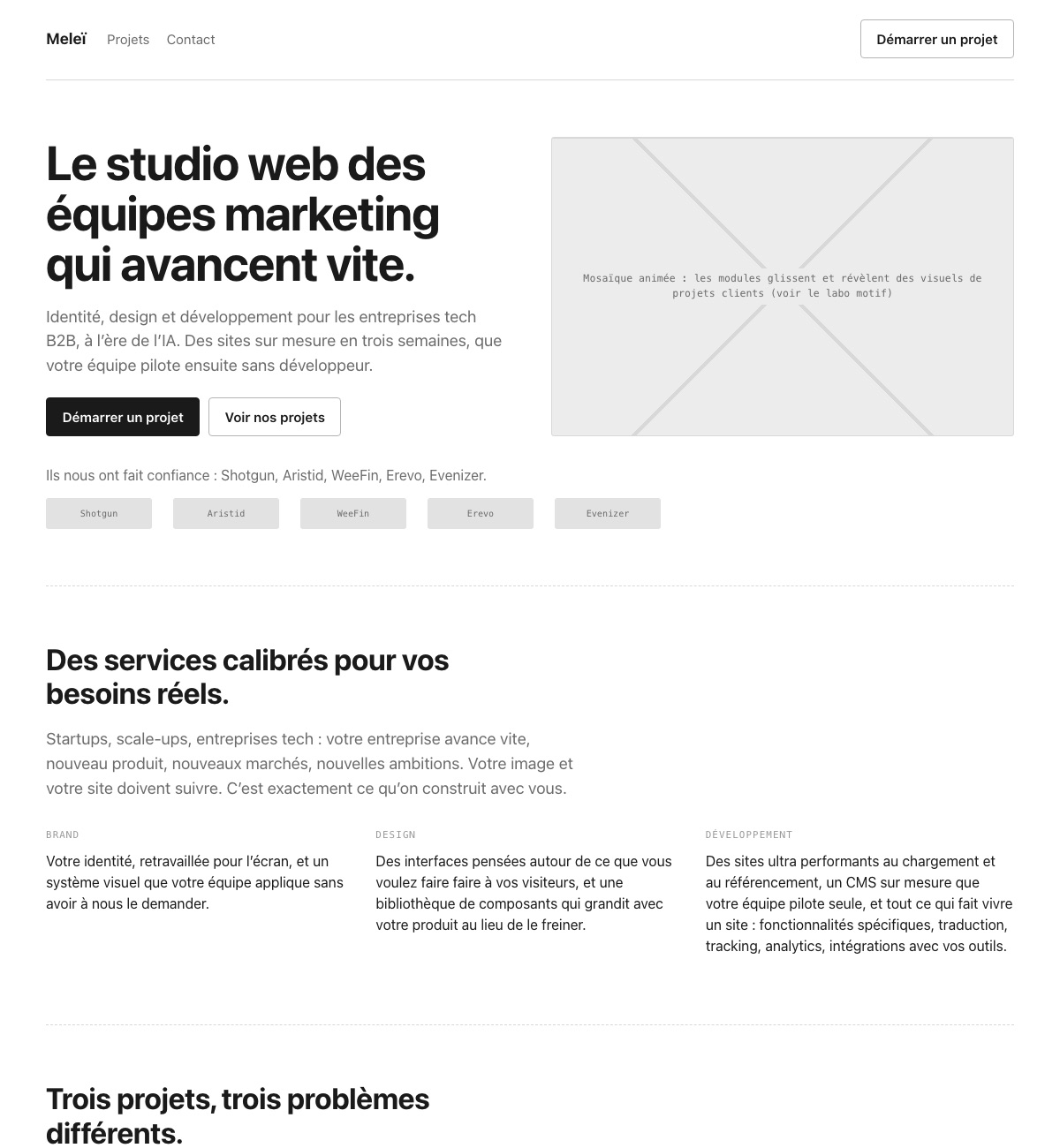
Next, before talking art direction, we locked in the content, again just like with our clients. Claude put together a wireframe of the home page, all in gray, with the sections in order and the copy we wanted to see in them. I edited each piece of text directly in the browser, and my changes were saved to a file that Claude then read back. I liked it better than any document, and that’s where I locked in the structure, eleven sections, then nine. The gray isn’t a coincidence. A wireframe that already looks like a design pushes you to settle the art direction too early.
What we gave the AI before the first mockup
An AI can’t guess an art direction. If you don’t give it anything, it reproduces what it has already seen everywhere. So before asking it for a single screen, I prepared what I’d prepare for any designer joining a project.
- Inspiration research. I organized it in Figma, with software company websites for structure and readability, and tech brand campaigns for texture, somewhere between pixels, grain and drawing.
- A base art direction, locked in Figma. The palette (a black, two khakis, a cream and a burgundy), the Uxum typeface, the logo and a first version of the Home page mockup that I had developed a few weeks earlier.
- Pattern explorations. Made from the logo’s pieces and already in the palette, with the square and the quarter circle from the icon, elongated rectangles, diamonds and grain on top.
- Decisions made before the mockup. Claude built two visual art direction questionnaires. In them, I chose between four palette families, between Uxum and three body fonts, between four patterns, and set the balance between light and dark sections.
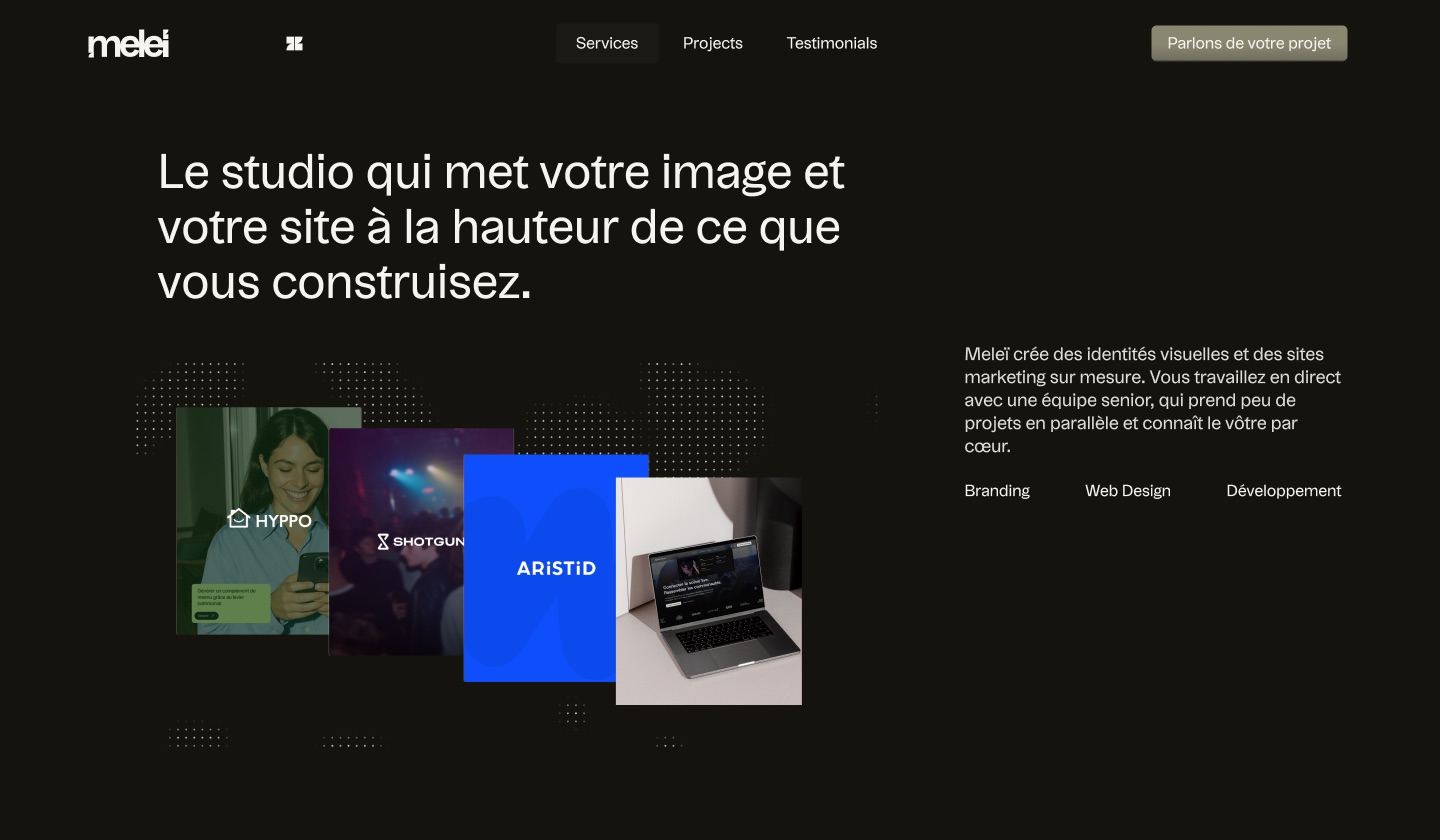 Figma mockup
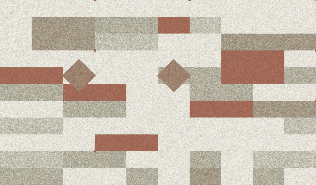 Pattern exploration
The difference showed right away. Claude’s first proposal picked up the palette but not my mockup, and it looked generated (more on that below). The next one, built on the structure of my mockup, started to look like us. That’s actually what had interested me since the brief, “Claude’s ability to roll out an art direction once it’s locked in.” AI doesn’t invent an identity, but it’s very good at rolling out the one you give it, as long as you move in stages and focus section by section.
AI proposes, we compare, we decide
On the first day of design, September 7, we started the classic way, first locking in a design system in four steps (palette, typography, building blocks, sections) before composing the pages. I dropped it that same evening, because “the simplest thing for me would be to start from a proposal and then iterate.” You make much better decisions in front of a real page than in front of rules.
The method that held up all the way through has three steps.
- Claude proposes several finished versions of an element. Not sketches, but real animated sections, right in the page. Usually three, sometimes fifteen.
- I compare them in the page. A hidden panel, which opens with Cmd+G, switches from one version to another. I show it further down, with the project’s other tools.
- I decide, I fine-tune and the rest disappears. The chosen version becomes the default and the others are removed from the code. The site keeps no trace of the discarded options.
What the AI did, step by step
At every step, the split was the same. Claude produces, researches and checks, and I choose.
| Step | What Claude did | What I decided |
|---|---|---|
| Brief and positioning | Read the code and the Figma files, wrote the questionnaire, analyzed about fifty pages from studio websites | The positioning, the three pages, how to talk about AI |
| Wireframe | A home page in gray, with click-to-edit text | The structure, eleven sections, then nine |
| Art direction | Two visual questionnaires, variations on the art direction locked in Figma, fifteen hero layouts | The base art direction in Figma, the graphic direction and the concept, the palette, the chosen layout |
| Patterns and mosaic | The pattern generator, its library, the animated mosaic in the hero | The visual material, drawn from the logo and my Figma explorations, the motion and the rhythm |
| Animations | Three entrance animations to compare for each section | Headings that come in line by line and thin rules that draw themselves, no fades or blur |
| English version | Nearly 700 sentences adapted, translated back into French wherever the English departs from it | The tone, the brand’s vocabulary, redirection by language |
| Tech and SEO | The code, the tags, the sitemap, the automated checks, much lighter images | The SEO checklist, then reviewing and approving every page before launch |
An English version reviewed sentence by sentence
The English version is generated from the French pages, which remain the single source. For each of the site’s roughly 700 sentences, Claude wrote an adaptation in American English. When the English departed from the French, it added a back-translation and the reason for the difference, which lets you check the meaning in your own language. And if a French sentence changes without its translation, the generator stops.
The tools built for the project
This is probably where AI changes the game the most. Without it, building a tool for a single website would never have been worth it. With it, I had three built during the project, and they’re still in use today.
A pattern and background generator
Starting from the direction locked in Figma, Claude built a generator that produces the backgrounds for all our visuals. You pick a preset (monochrome, sparse, accent…) and a format (screen, banner, square, portrait), adjust the density and grain, and the tool builds compositions from the logo’s pieces, always within the palette. Every setting lives in the page URL, and you export as PNG, or as SVG to bring the background back into Figma. It was built in a single day.
A library then gathers the approved backgrounds, each with where it’s used, like a process step, the CMS scene or the project pages. One click reopens a background in the generator to adjust it, another exports it in the right format. These tools produced the service visuals, the isometric cubes and our social media banners, and they still make the covers for this blog.
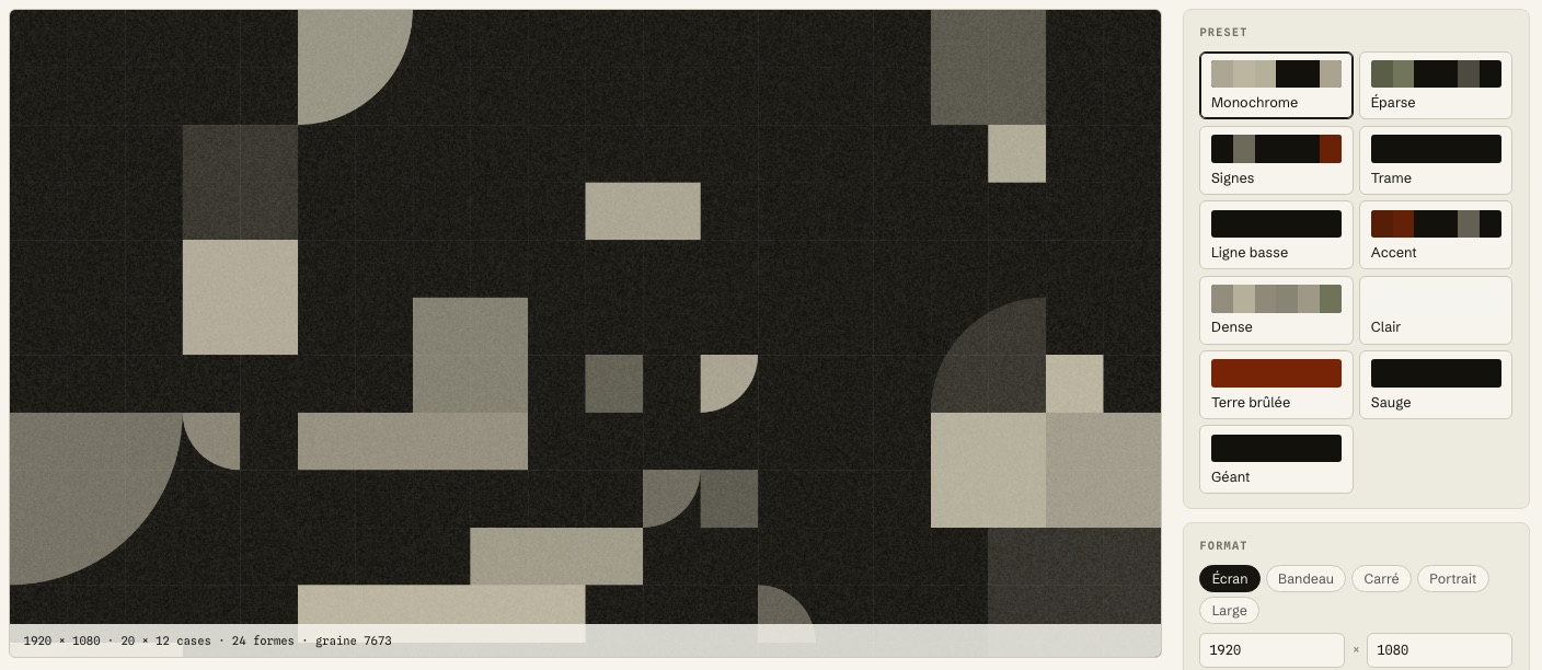 The generator
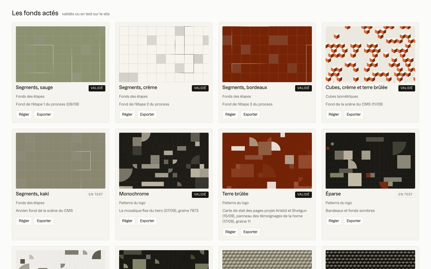 The library
The animated mosaic at the top of the home page starts from the same setting. It moves its pieces cell by cell, without fades, and every so often reforms the studio’s icon. To check that the icon comes back together pixel-perfect, Claude wrote a probe that watches the page frame by frame. The result was zero anomalies, on desktop and mobile alike.
An icon generator, to test icons in context
The icon generator works on the same principle. Claude designed a full set of icons in several styles, first outline, solid and badge, then pixel, cutout and isometric cubes, always within the palette. The tool shows them in the site’s real slots (a process step, cards, a dark section), and a button drops them into the home page so you can judge them in place. I kept the solid, geometric, two-tone style, then Claude reworked the proportions so every icon takes up the same space in its square.
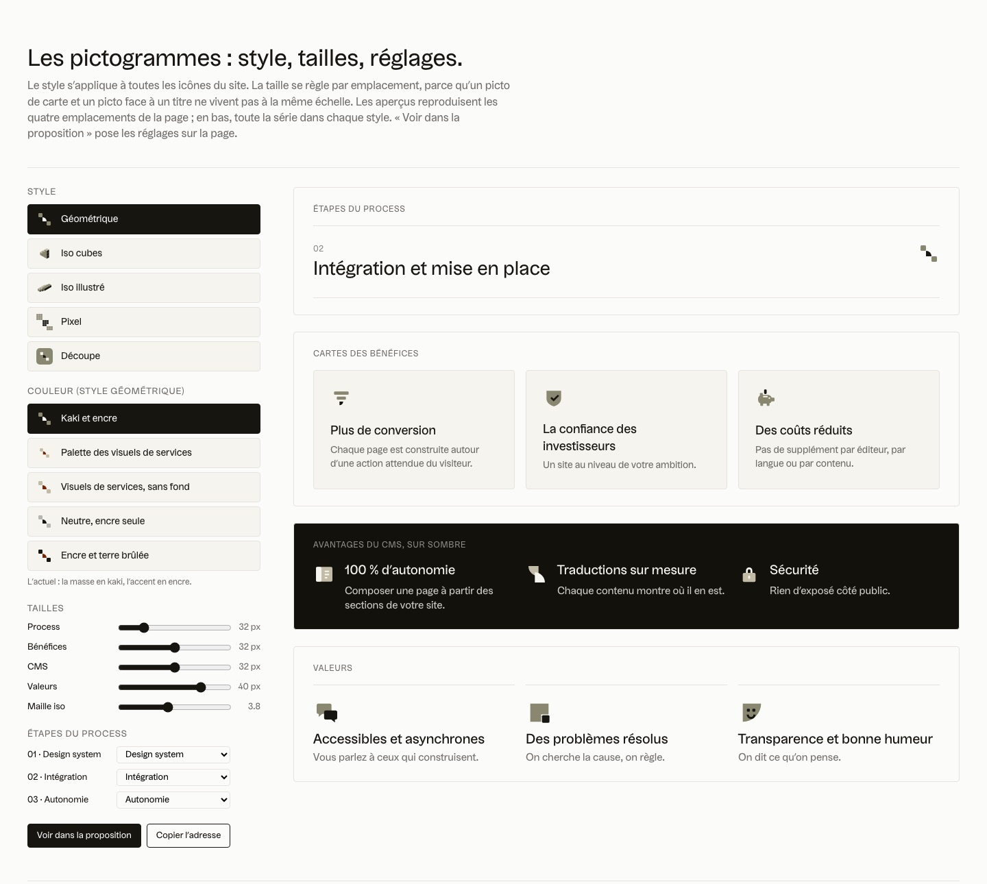 The icon tool
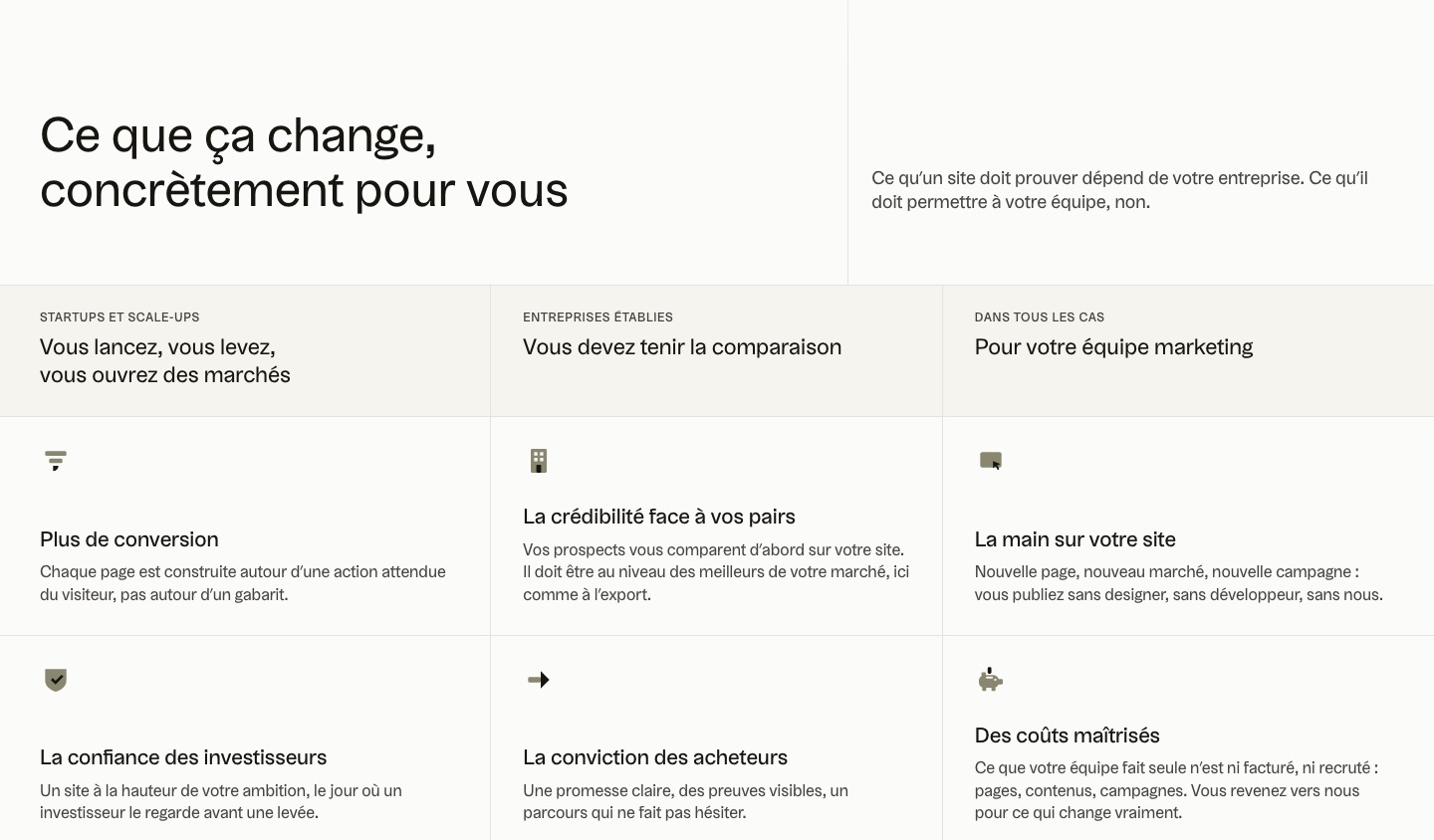 On the site
The Cmd+G versions panel
The third is the simplest, and maybe the most useful. It’s the hidden panel that opens with Cmd+G and switches from one version to another in the real page. Every setting is written into the page URL, so I can share exactly what I see.
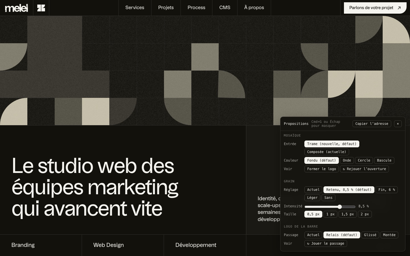
We used it throughout the project. Instead of back-and-forth with screenshots and comments, we decide in front of the real page. We now use it on our clients’ mockups.
How much time did AI save us?
The project took a month. In one month, we locked in the art direction, designed and prototyped the pages, launched the site in French and English, and did all the optimization, SEO included. Without AI, developing a site at this level, with its animations and micro-interactions, would have taken me at least a month and a half for the code alone. Here, there wasn’t even a separate front-end build phase, since the approved mockup was already the site.
But the real payoff isn’t time, it’s creativity. When I announced the site, I wrote that Claude had “multiplied our creativity tenfold.” When a finished version costs a few minutes instead of a day, you no longer compare two, you compare fifteen. On September 7, Claude proposed fifteen layouts for the home page hero in one evening, and I flicked through them from the versions bar. Each section got three animated entrances to compare, and the testimonials went through twelve layouts before the right one. Without AI, most of these options would never have existed. We would have stopped at the first one that held up.
What the AI got wrong
Claude’s first proposal, on September 7, was clean and consistent, but interchangeable. I answered in one sentence, “It really looks like a site generated by Claude.” It had everything you see everywhere, with very bold headings, two buttons, a small “Services” label preceded by a square above the headings, and cards with generic illustrations. We kept it as is, for the record.
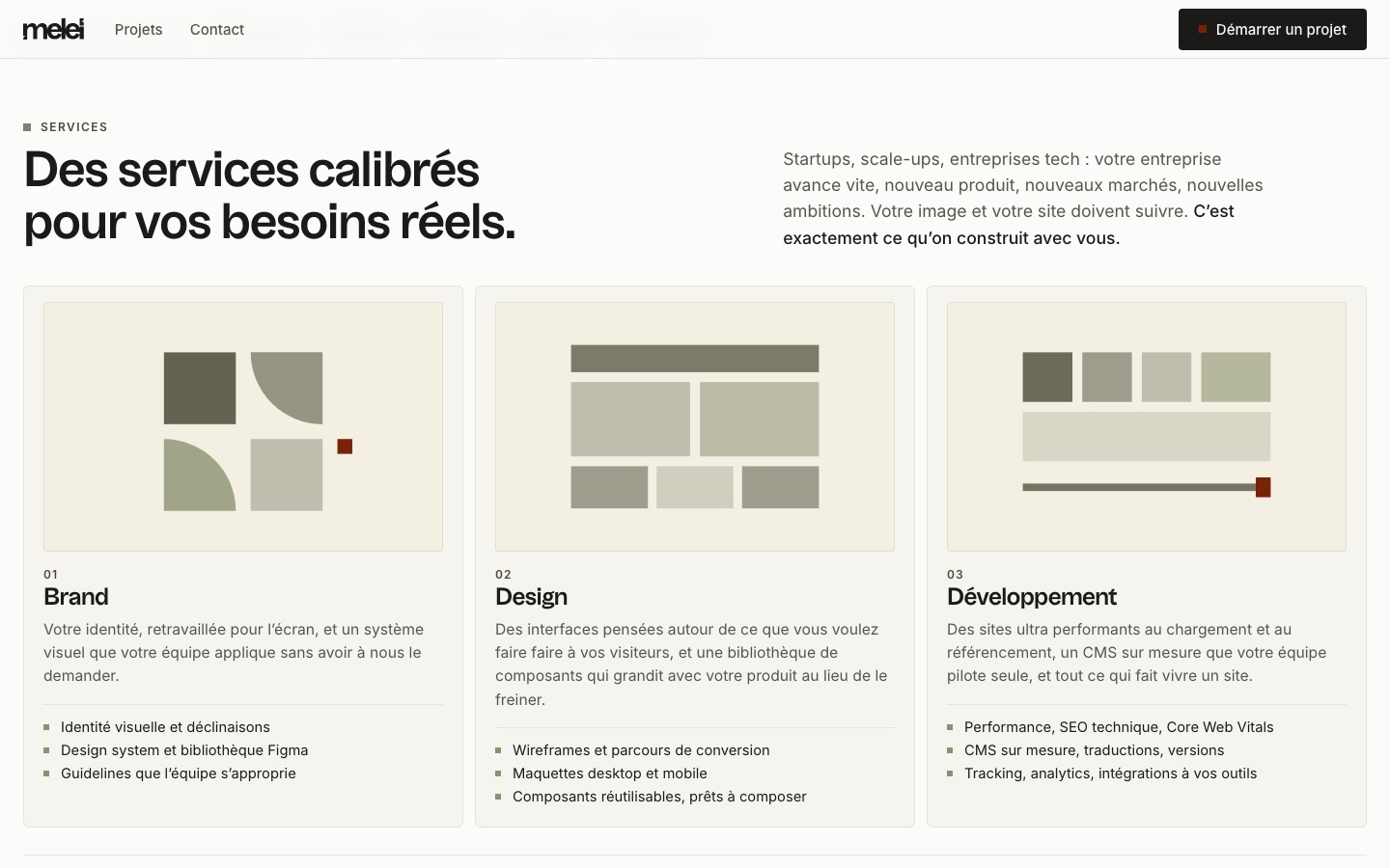 Sept. 7 proposal
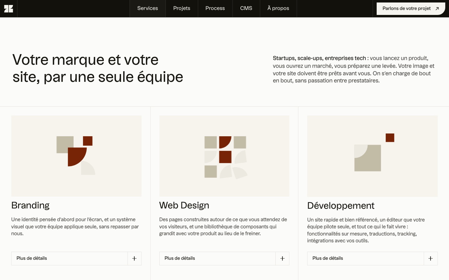 Live
The other misses fall into three groups.
- The “generated” giveaways. Claude reacts a bit like a robot. It wants everything to be clear, so it numbers steps everywhere, 1, 2, 3, 4, even when the text isn’t describing steps. It looks generated, and often it doesn’t even fit what’s being said. There were also the small-square labels, which felt “too AI-generated,” the em dash, banned from all our copy for the same reason, and an entire block Claude had written in the process section to explain what it did for us. I had it taken out.
- Misreadings. Claude mistook our typeface for another one and proposed an orange palette when the real one was burgundy (“not an orange but a kind of burgundy”). It took “background” to mean the background of a visual when I meant the section’s background, and it added uses of the logo to the launch animation that we had never settled on.
- Bugs. A misplaced comment that broke the page’s script, a section whose height kept shifting, and a flash when the mosaic loaded that took four rounds to fix.
I’m the one who spotted most of these misses, by eye, in front of the page, not the AI. That’s its clearest limit. Claude is very good at checking what you ask it to check, with a probe or an automated test, but it doesn’t see on its own that a page looks generated. And no wonder. An AI has no taste. What it proposes is the result of numbers, code and math, so it’s often the average of what it has already seen.
AI is a tool, a trained eye is a craft
The eye, though, is something you train. It comes from years of projects, of art direction, of pages redone until they hold up. That’s why I often say that AI is a tool, and that the eye, the choices and the decisions remain design expertise.
Handing Claude to someone without the eye is a bit like giving a bag of money to someone who knows nothing about fashion. Even with access to every store in the world, they’ll still walk out the worst-dressed.
On this project, that expertise covered three things we never handed over to Claude.
- Art direction. The palette, the typography, the patterns’ visual material and the starting mockup, locked in Figma before the first line of code. Then, along the way, no drop shadows, and no “Apple-style” animations with fades and blur.
- Copywriting. What each page needs to say, from the positioning to the headings and the numbers on display. Claude suggests copy, but I keep control of the message.
- Choosing between versions, and fine-tuning. Fifteen layouts are useless if there’s nobody there to keep one. Knowing which one to keep, and why, is exactly the craft. I’m also the one who said no to a shape added to the patterns, to livelier entrances for the mosaic, to an animation that felt “too video-gamey.”
That’s the whole difference between a site generated by a novice and a site made by a designer who uses AI as a design tool. Both have access to the same model. What changes is the eye that sorts through what it produces.
AI remains a tool. Without expertise, it’s a toy.
How can a designer get started with AI?
If you’re a designer who wants to get into AI without quite knowing where to start, I recommend thinking in terms of a funnel. You start wide, then narrow down at each step.
At the top of the funnel, you think before you produce. A brief, goals, what the site needs to bring to the business. Then, for a website, you gather everything you already have (the art direction, the inspiration, the logo, the content) and cast a wide net to feed the AI. The more material it has, the less it makes up. Only then do you ask it for proposals, several each time, and it’s the designer’s eye that narrows things down to the right one.
So using AI well is a mix of method and eye. The method gives it something to work with, the eye lets you sort through what it produces.
That’s why I don’t believe AI will replace designers anytime soon. The eye and expertise are still what separate an amateur from a professional. That said, it’s going to completely upend the profession. In creativity, speed of execution and technique, it’s knocking down barriers that used to be much higher. On this project, that meant a pattern generator built in a day, and a launch animation of about fifty seconds made without any animation software, from a web page filmed frame by frame. I’ll walk through how it was made in an upcoming article.
Is a generator enough to build a website with AI?
For a simple page, yes. For a brand website, not really. When you search for “build a website with AI,” you mostly land on website generators. You describe your business and the tool produces a page in a few minutes. For a quick launch, an event page or an early market test, that’s a good answer, fast and cheap.
For a brand website, on the other hand, the point isn’t to produce a page, it’s to choose among all the ones you could produce. Our first proposal actually looked like what a generator spits out, decent and similar to plenty of others. What made the difference after that was the method and the eye I just described, in design as much as in code, SEO included.
What this changes for our clients
This is now the studio’s method. The time saved isn’t only about delivering sooner, it lets us explore more with you before deciding. And the site we deliver stays yours. Your team runs it afterward without a developer.
Frequently asked questions
Can you build your website with AI?
Yes, for all of the production, from mockups to code, including patterns and translation. We built the Meleï Studio website with Claude in one month. But you have to give it an art direction, and AI doesn’t choose. The message and the choice between versions are still human work, otherwise the site looks generated.
How long does it take to build a website with AI?
For the Meleï Studio website, it took one month from brief to launch, in French and English. On the front-end build alone, we saved at least a month, since without AI it would have taken a month and a half at the very least.
Which AI tool did you use?
Claude Code, Anthropic’s coding tool, with its Fable and Opus models, Fable for most of the work.
Will AI replace designers or developers?
Not anytime soon. AI is a tool, and it has no taste. The eye and expertise are still what separate an amateur from a professional, in design as much as in code. That said, it’s already upending the profession, because it knocks down barriers of creativity, speed and technique.
Does a website built with AI rank worse?
No. Google judges the page, not the tool that produced it. What it penalizes is mass-produced pages with no value. A site built with AI ranks like any other, with text that’s readable without JavaScript, the right tags and useful content.