 Théo Sabaté
A website redesign almost always starts with the same sentence: “our website doesn’t feel like us anymore.” The product has changed, the target audience has come into focus, the marketing team wants to publish without waiting on a developer. But behind the urge to change your image, there are weightier decisions. What do you keep? What technology do you rebuild on? And how do you avoid losing what Google took years to give you?
Here we walk through a redesign step by step, with how long it takes, what it costs, and the mistakes we see most often. These benchmarks come from seven years of web projects, most of them for startups and scale-ups.
What is a website redesign, and when should you do one?
A website redesign takes an existing site and reworks it so it serves the company’s goals again. It can touch the look, the structure, the technology, or all three at once. What sets it apart from a brand-new site is what’s already there. There’s existing content, URLs that Google knows, team habits, and traffic numbers, and a good redesign starts from there instead of wiping the slate clean.
| Type of redesign | What changes | When to choose it |
|---|---|---|
| Visual | The identity, the mockups, the visuals. The structure stays. | The brand has evolved and the site looks dated, but it still brings in inquiries. |
| Structural | The site structure, the user journeys, the content. | The offering or the target audience has changed, and visitors can’t find what they’re looking for. |
| Technical | The CMS, the hosting, the code. | Every change goes through a developer, or the site is slow and hard to keep up to date. |
In practice, the three often overlap. Take Erevo, a French continuing education provider for healthcare professionals. Its site ran on Prismic, and every update went through a developer. So the redesign started from a technical need, and it became the opportunity to refocus the site on its courses and its audiences, and to modernize the brand.
A few telltale signs:
- The site no longer says what you sell, or to whom.
- Your marketing team waits on a developer to publish a page.
- Visitors show up, but they don’t ask for a demo or a meeting.
- You’re expanding into a new market, and the site only speaks one language.
Two decisions to make before you start
They weigh on everything else in the project, and you make them before the first mockup.
Who should handle your redesign
A freelancer works for a simple site, when you know exactly what you want. An agency brings a full team and processes built for large projects. A studio sits between the two, with a tight-knit team that covers strategy, design, and development, with no handoffs from one provider to another.
Whatever you choose, ask your future provider these four questions before you sign.
- Can they show comparable redesigns, with measurable results?
- Does the same team take you from messaging to launch?
- What do they hand over at the end (access, documentation, training)?
- How will they protect your search rankings during the migration?
Which technology to build on
It’s often the first question a team asks when it kicks off a redesign. The right choice depends mostly on who will run the site after launch.
| Option | Who it’s for | Good to know |
|---|---|---|
| Webflow | A marketing team that wants to create and edit its own pages, with no code. | A subscription that includes hosting. Quick to learn, more limited for very specific needs. |
| Astro + Sanity | A very fast site, rich in content or languages, that you keep ownership of. | A custom editor for the team, with content in a Sanity account in your name. You need a studio that knows how to set it up. |
| 100% custom | Very specific needs, and an in-house tech team. | AI speeds up production, not upkeep. Maintenance falls on your developers. |
And WordPress? We don’t recommend it for a startup’s website. Between the plugins, the endless updates, and the security holes, the marketing team ends up depending on a developer to publish. In fact, many companies are leaving it for Webflow today.
The 9 steps of a website redesign
The table follows a one-month redesign, a common timeline today with AI.
| Step | What gets decided | When |
|---|---|---|
| 1. Taking stock | Auditing the existing site, what to keep and what isn’t working | Week 1 |
| 2. Goals and audience | Who the site speaks to, what you want from visitors | Week 1 |
| 3. Site structure and user journeys | The pages, and the path to getting in touch | Week 1 |
| 4. Content and redirects | The copy, and where each old URL goes | Weeks 1 and 2 |
| 5. Art direction | The visual language, chosen from several directions | Week 2 |
| 6. Design system and mockups | The visual rules, then the pages | Weeks 2 and 3 |
| 7. Development and migration | The build, the CMS, the content migration | Weeks 3 and 4 |
| 8. Launch and handoff | The switchover, training the team | End of week 4 |
| 9. Tracking | The numbers to watch, the adjustments | The next three months |
Two projects illustrate the steps that follow:
- Shotgun Pro, the event organizer website of Shotgun, the French live music ticketing scale-up (steps 1, 2, 6, and 8);
- Erevo, the healthcare training provider introduced above (steps 3, 5, and 9).
1. Take stock
It all starts with an audit of the current site, to see what it actually does before a single mockup. We look at which pages draw traffic from Google, which ones lead to an inquiry, which searches the site already shows up for, and what the team can’t manage on its own. It’s also the time to list every existing URL, which will feed the redirect plan.
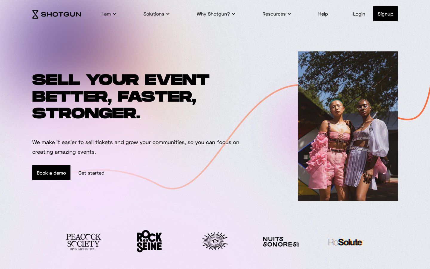
For Shotgun Pro, the audit showed a site that addressed three profiles and walked through four product solutions, without saying who it was speaking to first. And on Google, it showed up on page two on average.
2. Set the goals and the audience
Without a measurable goal, a redesign gets judged on personal taste. Set two or three, with numbers if possible, like more demo requests, entering a new market, or a team that runs its own pages. Then decide who the site speaks to first.
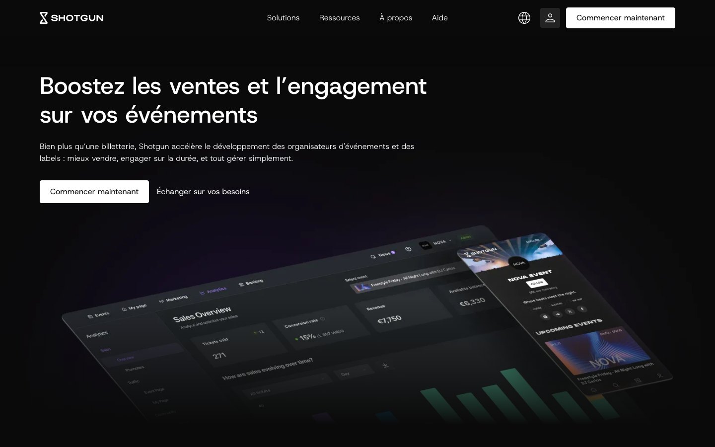
Shotgun Pro had to win over five audiences. Three it already reached (clubs, collectives, and festivals) and two it set out to win (labels and tour promoters). Each one got its own page, with its own promise, and the messaging went from “sell better” to “fill your shows and keep your fans.”
 Before
 After
3. Rethink the site structure and user journeys
The site structure is the list of pages and how they connect. The right starting point is your visitors’ questions, not the company’s org chart. And for each page, just ask yourself what you want the visitor to do next.
The Erevo site structure
- Courses7 professions
- Nurses
- General practitioners
- Physical therapists
- Dentists
- Podiatrists
- Pharmacists
- Speech therapists
- One page per course, each with its own form
- Funding1 page
- Resources1 page
- Team
- Blog
- FAQ
Main button: “Sign up,” leading to a registration form
- Coursesfind yours
- Filterable catalog
- 8 professions
- Healthcare facilities
- Fundingpay for it
- DPC
- FIF PL
- Self-funding
- Eligibility calculator
- Resourcesstay up to date
- Mediquiz
- Tools and tutorials
- Fact sheets and white papers
- Expert reports
- Blog and FAQ
- Abouttrust them
- Our approach
- Methods and formats
- Trainers
- Partners
Main button: “Sign up for our courses,” leading to the catalog
4. Write the content and prepare the redirects
The copy and the URLs get locked in before production, because a mockup is designed around real content, not placeholder text. This is the part the company has to feed, since only it knows its customers, its numbers, and its proof points. It often takes longer than planned, so start it in the very first week.
It’s also the step for the redirect plan, a table that maps each old URL to its new page. Google follows these redirects, known as 301s, and passes the ranking the old page had earned on to the new one. Its documentation on site moves with URL changes lays out the steps.
5. Define the art direction
A redesign almost always comes with a visual refresh. Either the company has just changed its identity, and the site needs to follow the rebrand. Or its positioning has shifted, and the visuals need to say the same thing as the new site structure and the new content. Art direction sets that visual language (the palette, the typefaces, the image treatment, the patterns) before a single page gets designed.
It starts with exploration. We work up two or three directions, each applied to a key screen like the top of the homepage, so you choose from real designs rather than a mood board. With AI, we explore more of them in the same amount of time, but the choice is still a matter of taste and strategy. The chosen direction becomes the foundation of the design system.
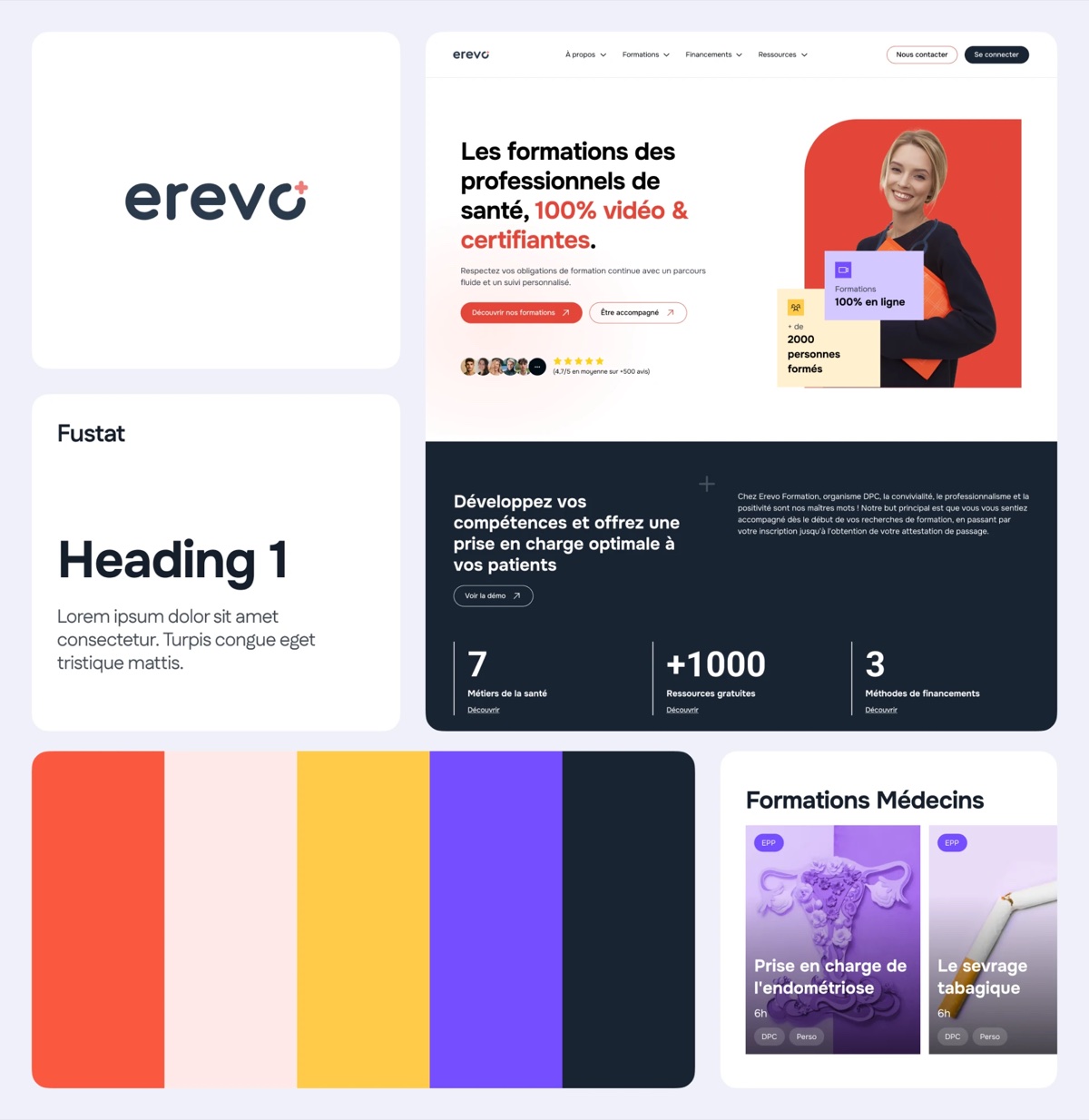 Direction 1 · ruled out
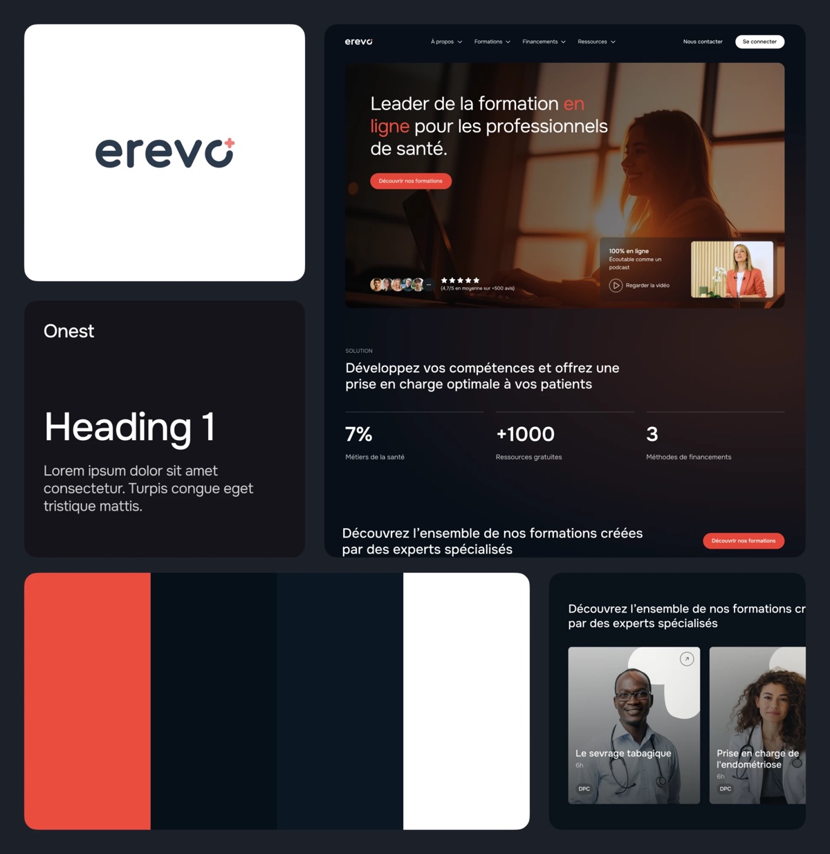 Direction 2 · chosen
6. Set up the design system, then the mockups
The design system turns the art direction into rules for colors, typography, spacing, and components. You set it once, before the pages. The mockups come next, page by page, with the real content. Since every page is built from the same sections, a change carries through everywhere.
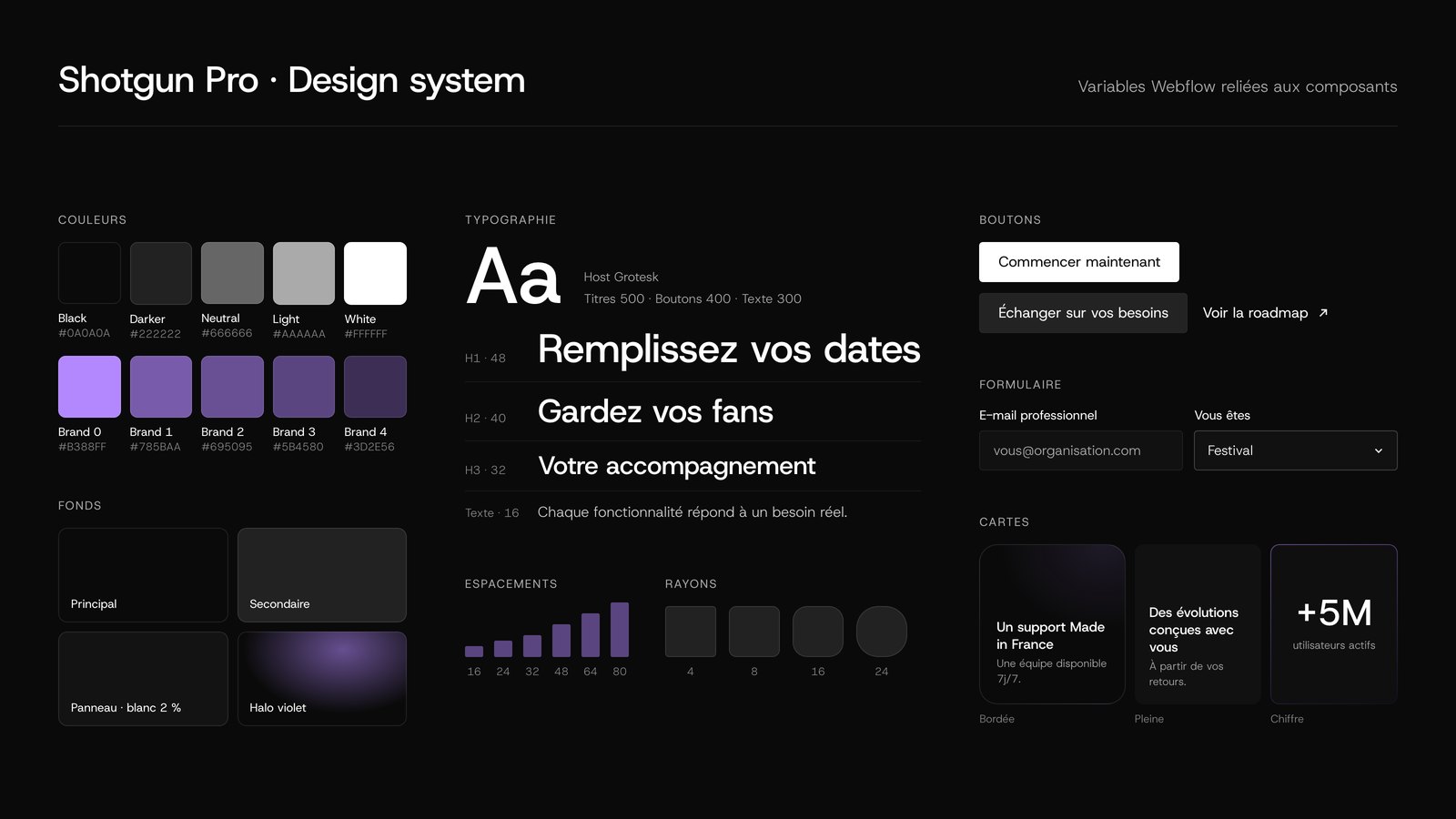
7. Build and migrate
The build turns the mockups into a website, on a staging URL that Google can’t see. That’s where the CMS, the forms, and the analytics tools get connected, and then the content from the old site is brought over. On a content-heavy site, it’s also the time to clean house. A blog with several hundred articles often only needs to keep some of them.
Today, the build is almost entirely produced by AI, under a developer’s supervision. So the choice of technology also affects the budget. On Webflow, AI has to go through the editor, element by element. On a code-based stack like Astro + Sanity, it writes the pages directly, with fewer limits and fewer tokens used. As a result, the build goes faster and costs less.
8. Launch and hand off to the team
The switchover takes preparation. The redirects are in place, the sitemap is submitted to Search Console, the forms are tested, and conversion tracking runs from the very first hour.
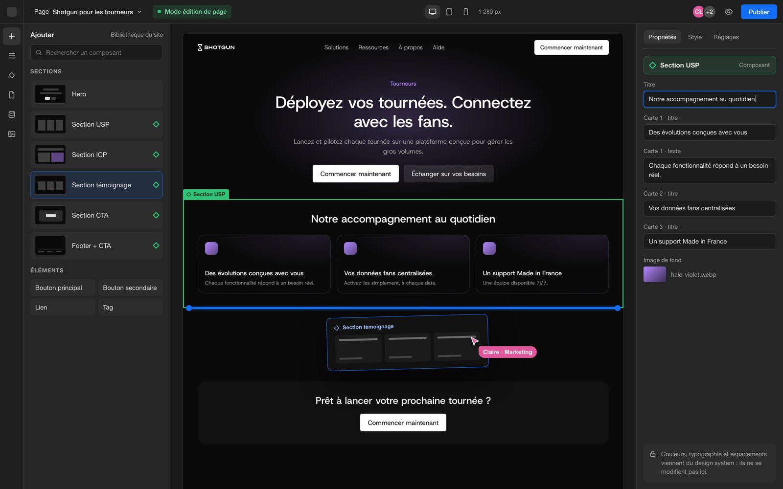
Then comes the handoff, on the live site. With a library of sections tied to the design system, the marketing team builds a new landing page on its own, without a developer and without breaking the rest of the site. It can also learn to run its site with an AI assistant like Claude, to create a page or translate content.
9. Track the impact of the redesign
A redesign doesn’t end at launch. To judge whether it paid off, you need numbers, compared with the same period the year before to cancel out seasonal effects. Here’s what to watch over the next three months, and where to find it.
| What to measure | Where to find it | What to expect |
|---|---|---|
| Contact and demo requests | Your CRM, Google Analytics conversions | More qualified requests |
| The conversion rate of key pages | Google Analytics | Entry pages that lead to a request |
| Clicks and rankings on Google | Google Search Console | No drop at the switchover, then a rise |
| The old URLs | Search Console, Pages report | No pages returning a 404 error |
| Visits from AI assistants | Google Analytics, sources such as ChatGPT, Perplexity… | A source that appears, then grows |
| Speed | PageSpeed Insights | Main content displayed in under 2.5 seconds |
| The team’s independence | Pages published without a developer | A team that publishes on its own |
The first months of Erevo’s new site, launched in summer 2025, offer a real example.
These numbers only exist because tracking was in place on launch day.
How long does a website redesign take?
For a startup’s marketing website, plan on three weeks to a month and a half today. Just two years ago, the same redesign took more like a month and a half to two and a half months.
Three weeks is the production time, for the audit, the design, and the build. With feedback, approvals, and launch, the project runs closer to a month from first conversation to go-live. Beyond that, what stretches it out is the number of pages and languages, the visuals to create, the content to write, and the number of people who sign off.
Scoping is what keeps you on schedule
Timelines depend as much on the method as on production. A provider who scopes the project from the start saves you weeks. Before you begin, agree on:
- written goals, with numbers if possible;
- a single point of contact on the company side, who gathers opinions and makes the call;
- a number of feedback rounds set in advance, for example two per mockup;
- feedback within 48 hours at most;
- a dated schedule, with its milestones and approvals.
These rules, as much as AI, are what let us shorten our timelines. On a one-month project, a few days of waiting is enough to push back the whole schedule.
The tools that save time
Collaboration tools matter too:
- Slack instead of email, because in a shared channel, a question gets settled within the hour.
- A single project space (a CRM, or a client portal on Notion) that brings together the schedule, the documents, the content to provide, and the decisions.
- Comments in Figma, left right on the mockup rather than on an annotated screenshot.
What budget should you plan for a redesign?
For a redesign of a startup’s marketing website, design, build, and content included, plan on €8,000 to €20,000 excl. VAT with a studio. The price range comes down mostly to the visuals to create (illustrations, product screenshots, animations), the number of pages and languages, and the content migration.
This budget covers the project. On top of it, add what comes back every month or every year, like the CMS subscription or hosting, and the time your team will spend keeping the site up to date.
The five most expensive pitfalls
- Losing your search rankings (SEO). Changing URLs without redirects means starting from zero on Google. The redirect plan gets prepared before launch, not after.
- Redoing the design without rethinking the messaging. A better-looking site that says the same thing will convert just like before.
- Choosing a tool the team can’t use. If every new page needs a developer, the site will age as fast as the last one.
- Trying to do everything with AI, without expertise. A website doesn’t generate itself in two clicks. Without a seasoned designer and developer to guide the AI, you end up with a site that’s impersonal and technically fragile.
- Launching without tracking. Without conversion tracking from day one, no one will be able to say what the redesign delivered.
What has AI changed about website redesigns in 2026?
AI hasn’t replaced any of the roles in a redesign, but it has sped them all up. You sometimes hear that with AI, a CEO can rebuild their website alone. For a launch or fundraising landing page, that’s true. One can be put together in a few hours today. For the site that carries your brand and your sales, it’s another story.
What has changed
Speed. Since 2025, we’ve been working almost twice as fast on audits, design, visuals, the build, and tracking. In practice, Claude produces the site structure and the wireframes from the design system, then our designers rework each page by hand.
Ambition, technical and creative. The time saved doesn’t disappear. It goes into pushing projects further. 3D, motion design, and micro-interactions used to take a lot of back-and-forth, and they’re much faster to prototype today. On the creative side, we compare more directions before choosing, sometimes fifteen instead of two, as with the Meleï Studio website, built with AI. We also make bold choices we would have ruled out for lack of time. And beyond the website, we can build custom tools, like a tracking dashboard, an internal tool, or an automation.
The stack. Marketing websites are moving to headless. The content lives in a CMS like Sanity, separate from the front end, which is built with a framework like Astro. AI works directly in that code, faster and cheaper than in a visual editor (see step 7), and the marketing team keeps an editing space designed for them.
What doesn’t change
AI has no taste. What it suggests often looks like the average of what it has already seen, and it takes a designer’s eye to know when a page is right. You also need a developer’s eye, because AI readily forgets SEO, speed, and the site’s technical health when no one experienced is guiding it. And strategy can’t be delegated. Who the site speaks to, what you keep, what you want from visitors. Those are business decisions. AI is still a tool, and everything depends on who uses it. That’s where a redesign is won or lost.
Frequently asked questions
How long does a website redesign take?
For a startup’s marketing website, plan on three weeks to a month and a half from first conversation to launch. More pages, languages, or content to migrate make the project longer.
How much does a website redesign cost?
With a studio, €8,000 to €20,000 excl. VAT for a startup’s marketing website. The range comes down mostly to the visuals, the number of pages and languages, and the migration.
Should you change your CMS during a redesign?
Only if the current tool is holding the team back, with a developer needed for every change, a slow site, or costly maintenance. That’s often the case with WordPress sites. Otherwise, the redesign can keep the same CMS.
How do you avoid losing your search rankings during a redesign?
By redirecting every old URL to its new page (a 301 redirect), keeping the content that brings in traffic, then monitoring Search Console after launch.
Can you rebuild your website with AI?
For a low-stakes page, yes. For the site that carries your brand and your sales, AI speeds up the work of a designer and a developer, but doesn’t replace them.